
Choosing the right colors for a website is a crucial aspect of web design, as colors play a significant role in influencing user emotions, perceptions, and behaviors. While individual preferences vary, certain color schemes tend to attract more users and convey specific messages effectively.
The choice of colors on a website is a critical element that significantly influences the success of the site. This importance stems from the psychological and emotional impact that colors have on users. Here are several reasons why website color is crucial for success:
Colors create an immediate visual impression. Users form initial judgments about a website within seconds, and color plays a pivotal role in shaping those impressions. The right color scheme can convey professionalism, trustworthiness, and relevance, positively impacting user perceptions.
Colors are a fundamental component of brand identity. Consistent use of colors across a website reinforces brand recognition and establishes a cohesive and memorable visual identity. A strong brand presence fosters trust and loyalty among users.
Colors significantly impact the overall user experience. A well-chosen color palette enhances readability, navigation, and usability. Users should feel comfortable and engaged, and the right colors contribute to a positive and enjoyable experience.
Colors evoke emotions and can influence user behavior. Understanding color psychology helps in creating the desired emotional connection with the audience. For example, warm colors like red and orange can convey energy and excitement, while cool colors like blue and green can evoke calmness and trust.
Colors play a crucial role in highlighting call-to-action (CTA) buttons. Vibrant, contrasting colors can draw attention to important elements, prompting users to take desired actions. Effective use of color in CTAs can significantly impact conversion rates.
Consideration of color contrast is essential for accessibility. Ensuring sufficient contrast between text and background colors enhances readability for users with visual impairments. Meeting accessibility standards not only broadens the audience but also aligns with ethical and legal considerations.
A unique and carefully chosen color scheme sets a website apart from competitors. Standing out in a crowded online landscape is essential for attracting and retaining users. Consistency in branding colors helps build a distinctive online identity.
Colors play a crucial role in mobile responsiveness. Ensuring that the chosen color palette remains effective and visually appealing across different devices and screen sizes is essential. Consistency in color presentation enhances the overall user experience on mobile platforms. It's imperative for designers to avoid responsive design mistakes, such as using colors that may appear differently on various screens or devices, to maintain a cohesive and engaging user interface.
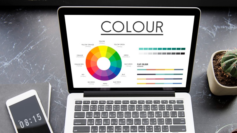
Here's an exploration of color psychology and the colors that commonly attract the most attention on websites:
Blue is a universally well-received color associated with trust, reliability, and professionalism. Many tech, finance, and corporate websites leverage blue to instill a sense of security and stability. Lighter shades of blue can create a calm and soothing atmosphere, while darker blues evoke a more serious and authoritative tone.
Green is commonly associated with nature, growth, and health. It conveys a sense of freshness and is often used in websites related to sustainability, wellness, and environmental causes. Green can also represent wealth and prosperity, making it suitable for financial and organic products. Lighter shades evoke tranquility, while darker greens can convey a sense of luxury.
Red is a powerful and attention-grabbing color associated with passion, energy, and urgency. It is often used in the food and retail industries as it can stimulate appetite and create a sense of excitement. However, red should be used judiciously as excessive use can be overwhelming.
Yellow is vibrant and cheerful, associated with warmth, positivity, and energy. It can capture attention and is often used for highlighting important information. Yellow is also associated with optimism and is commonly used by brands that want to convey a friendly and approachable image. However, it's important to use yellow carefully to avoid visual fatigue.
Orange combines the energy of red and the friendliness of yellow. It is associated with enthusiasm, creativity, and warmth. Orange can be attention-grabbing and is often used for calls to action or to highlight important elements. It's a popular choice for brands that want to convey a sense of innovation and friendliness.
Purple is associated with luxury, creativity, and sophistication. It can convey a sense of mystery and is popular in industries related to beauty, wellness, and high-end products. Lighter shades of purple are calming, while darker shades can evoke a sense of royalty and exclusivity.
Black is versatile and sophisticated, often associated with luxury, elegance, and professionalism. It creates a sense of formality and is popular in fashion, automotive, and high-end product websites. Black provides a strong contrast that can make other colors stand out, contributing to a sleek and modern aesthetic.
White is associated with cleanliness, simplicity, and neutrality. It is often used as a background color to create a minimalist and modern look. White enhances readability and allows other colors to stand out, making it a popular choice for technology and healthcare websites, where trustworthiness is paramount.
Multicolor websites use a combination of hues to create a vibrant and dynamic visual experience. This approach is often seen in creative industries, event websites, and platforms targeting a younger audience. Careful color coordination is essential to maintain a cohesive and visually appealing design.
In conclusion, while the impact of colors can be subjective and context-dependent, these general associations provide insights into the colors that often attract users. Successful websites leverage these associations to create visually appealing and emotionally resonant designs that align with their brand identity and target audience preferences.
